

SANSGENKI
2021
Branding | Illustration | Fashion
SANSGENKI.
(Stylised in all caps)
sans (preposition) - without
genki (adjective) - energy/good/liveliness (Japanese)
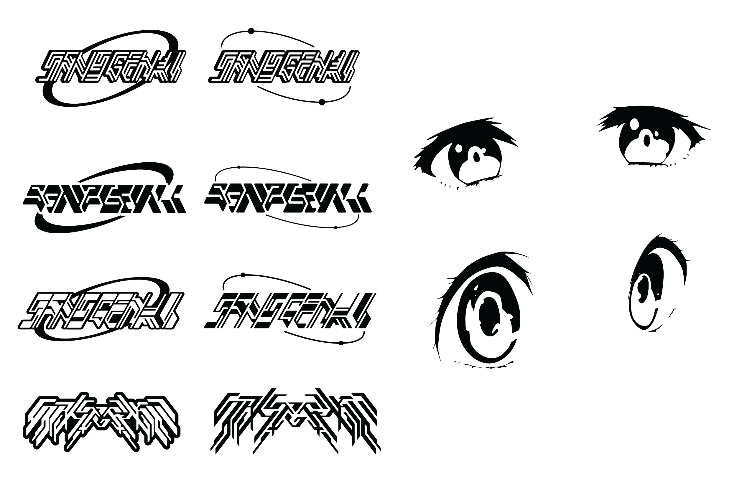
The beginning iterations of the logo explored various nuances associated with the Y2K visual identity. Vectorised drop shadows, italicised lettering, space rings and anime kawaii-ness.
SANSGENKI aimed to combine these elements with a cyberpunk/neon-rave colour scheme and expose this graphical subculture niche to the local Melbourne streetwear scene. The final logo devised encompasses these values and communication goal in creating a distinctly outstanding and recognisable brand mark composed of a typographical component and a secondary illustrative mark.
This was first applied to black hoodie garment, allowing the vibrancy of the logo and brandmark to the wearer’s statement of their outfit. This design choice reflects the idea of dark cyberpunk scenes illuminated by the bright neon lights of the city.
While I think the Y2K style has definitely been etching its way back into the Melbourne streetwear scene, I think there is still room for graphical characteristics of Y2K that still aren’t fully represented. Part of the Y2K revolution was the newfound and now tacky technological advances that were created, often being over-the-top and far too glamorous. This included huge kawaii anime eyes and incredibly eclectic and bubbly tech-like fonts. SANSGENKI looks to re-position the Y2K movement to include these underbelly nuances that are often overlooked when Y2K is in the conversation.
Hoodie Drop Sept/2021


100% Cotton
Puff and screen printed
Modelled by:
@funky.fraz
@jeromey_my_homie


100% Cotton
Embroidered
Modelled by:
@eloisemclachlan
@riordan.jones
